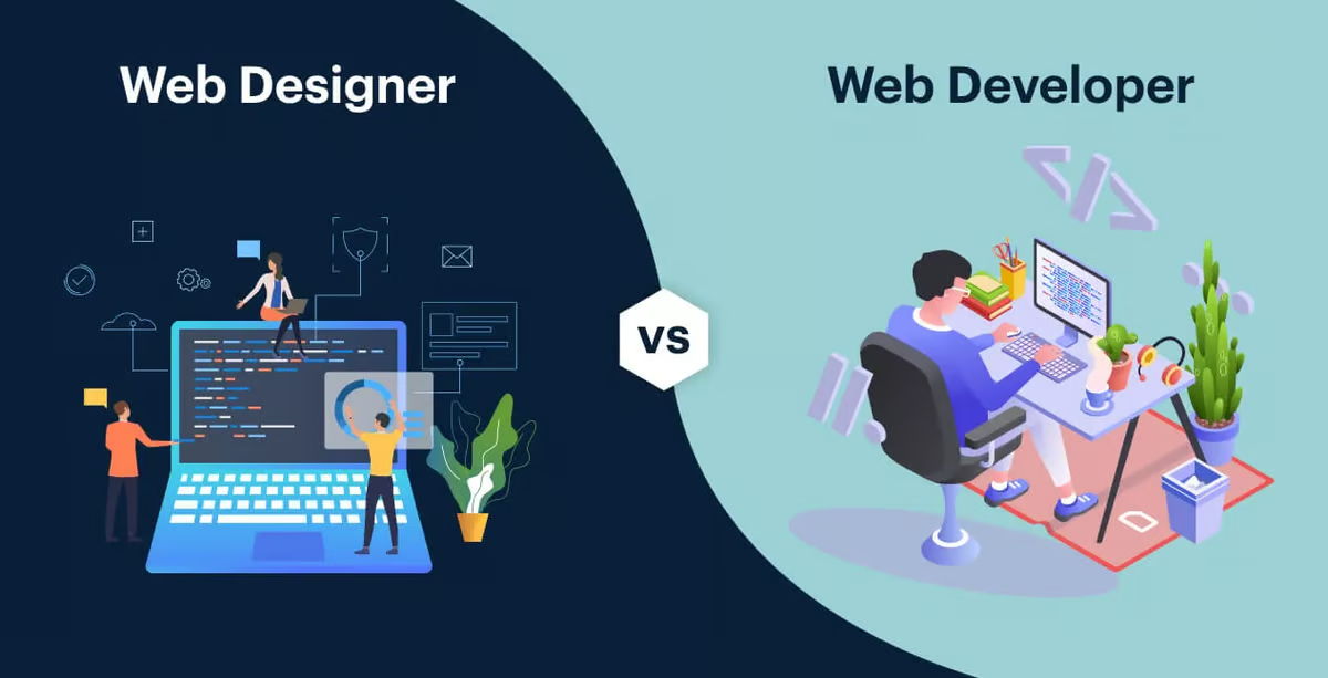
As a developer, creating responsive WordPress pages is essential for modern web development. With mobile usage on the rise, ensuring that your WordPress site looks and functions beautifully on any device is no longer optional.
Responsive design is all about making a website look good on different screen sizes, whether it’s a desktop, tablet, or mobile phone.
In this article, we’ll explore how developers can design responsive WordPress pages using HTML and CSS, providing practical tips for both new and experienced developers.
How Can You Achieve Responsive Design in WordPress?
Responsive design is the practice of making a website’s layout adaptable to various screen sizes and resolutions. It involves using flexible grids, layouts, and images, as well as media queries.
WordPress offers a solid foundation for building responsive sites thanks to its flexibility and compatibility with various plugins and themes.
However, achieving a fully responsive design often requires additional customization with HTML and CSS. This is where app development tools like DhiWise’s Figma to HTML make the process easier by converting Figma designs directly into responsive HTML. This saves time and keeps your design consistent on all devices.
Why Responsive Design Matters?
Responsive design improves user experience, ensuring visitors can access information, navigate, and interact with your website regardless of their device.
It also has an impact on search engine rankings since Google favours mobile-friendly sites.
Additionally, responsive design contributes to lower bounce rates, longer user sessions, and higher conversion rates.
Kickstarting Responsive WordPress Page Design
To design a responsive WordPress page, a developer will need basic knowledge of HTML, CSS, and WordPress theme development.
Here’s a step-by-step guide to get you started:
Step 1: Choose a Responsive WordPress Theme
Most modern WordPress themes are designed to be responsive. As a developer, Start by selecting a theme with a flexible layout and built-in responsiveness.
Themes like Astra, OceanWP, and GeneratePress offer robust options and customization features for building responsive sites.
However, even with a responsive theme, a developer may want to make adjustments using HTML and CSS to create a truly unique design.
Step 2: Create a Child Theme
If you’re customising an existing theme, it’s best to create a child theme to prevent losing changes during theme updates.
A child theme allows you to add or override styles and functionalities without modifying the original theme files.
To create a child theme:
In your WordPress installation directory, navigate to wp-content/themes/.
Create a new folder for your child’s theme.
Inside this folder, create a style.css file and add the following code:
Css
/*

Theme Name: Your Child Theme Name

Template: ParentThemeFolderName

*/
Add a functions.php file and enqueue the parent theme’s style.
Php
<?php

function child_theme_styles() {

wp_enqueue_style('parent-style', get_template_directory_uri() . '/style.css');

}

add_action('wp_enqueue_scripts', 'child_theme_styles');

?>
Step 3: Set Up Your HTML Structure
In WordPress, HTML structure is largely determined by the theme’s PHP files. For example, header.php, footer.php, and sidebar.php each contribute to the HTML structure of your page.
The main layout file, usually page.php or single.php, defines the page structure. Modify these files within your child’s theme as needed to create a custom HTML structure that suits your responsive design.
For instance, you might want to create a container for your main content and sidebar:
html
<div class="container">

<main class="content">

<!-- Your main content goes here -->

</main>

<aside class="sidebar">

<!-- Sidebar content goes here -->

</aside>

</div>
Step 4: Write Responsive CSS
Once your HTML structure is ready, it’s time to apply CSS to make the layout responsive. Responsive CSS is typically accomplished using media queries, which adjust the layout based on the screen width.
Here are some common CSS techniques to make your WordPress pages responsive:
Flexible Grids and Containers
Define flexible grid layouts using percentages rather than fixed pixel values. For example, the main content could occupy 70% of the container width, while the sidebar takes up 30%.
css
.container {

display: flex;

flex-wrap: wrap;

}

.content {

width: 70%;

}

.sidebar {

width: 30%;

}
Media Queries for Screen Sizes
Use media queries to adjust the layout on different screen sizes. For example, on screens smaller than 768px, the sidebar could be moved below the main content.
css
@media (max-width: 768px) {

.content, .sidebar {

width: 100%;

}

}
Responsive Typography and Images
Make typography responsive by setting font sizes in relative units like em or rem instead of px. Similarly, use max-width: 100% on images to make them scale down within their containers.
css
body {

font-size: 1em;

}

img {

max-width: 100%;

height: auto;

}
Step 5: Customise Navigation for Mobile
A key part of responsive design is making navigation mobile-friendly. One way to do this is by creating a mobile menu that appears only on small screens.
Many themes come with built-in mobile menus, but you can create your own by hiding the regular menu and adding a “hamburger” icon for mobile.
Here’s an example of a simple mobile menu using CSS:
css
.nav-menu {

display: flex;

justify-content: space-between;

}

.hamburger {

display: none;

cursor: pointer;

}

@media (max-width: 768px) {

.nav-menu {

display: none;

}

.hamburger {

display: block;

}

}
Add JavaScript to toggle the mobile menu visibility when the hamburger icon is clicked.
Step 6: Implement CSS Flexbox and Grid
CSS Flexbox and Grid are excellent tools for creating responsive layouts. Flexbox is perfect for one-dimensional layouts, while CSS Grid works well for more complex two-dimensional layouts.
Using Flexbox
For a responsive layout with Flexbox, create a wrapper container and use flex properties to control the alignment and distribution of child elements.
css
.container {

display: flex;

flex-wrap: wrap;

justify-content: space-between;

}

.content, .sidebar {

flex: 1 1 45%;

}
Using CSS Grid
Grid offers more control over layout, making it ideal for responsive design.
css
.container {

display: grid;

grid-template-columns: repeat(12, 1fr);

gap: 1rem;

}

.content {

grid-column: span 8;

}

.sidebar {

grid-column: span 4;

}

@media (max-width: 768px) {

.content, .sidebar {

grid-column: span 12;

}

}
Step 7: Test Responsiveness on Different Devices
After styling, test your WordPress site on various devices and screen sizes. Use browser developer tools, online services like BrowserStack, or physical devices to see how the page looks. Check for any issues in layout, typography, images, and navigation.
Step 8: Optimise for Performance
Performance is essential for mobile responsiveness. A slow site can drive users away, especially on mobile networks. Here are some tips to optimise your responsive WordPress pages:
- Use Optimised Images: Compress images with plugins like Smush or TinyPNG.
- Minify CSS and JavaScript: Use plugins like Autoptimize or W3 Total Cache.
- Lazy Load Images: Delay loading images until they’re in the viewport with plugins or native HTML attributes.
- Leverage Caching: Cache static assets to reduce server load.
Additional Tips for Designing Responsive WordPress Pages
- Avoid Fixed-Width Layouts: Use percentage-based widths for better fluidity.
- Use CSS Frameworks: Bootstrap and Foundation provide responsive grid systems that speed up development.
- Utilise WordPress Plugins: Plugins like Elementor and WPBakery offer responsive design options directly in the WordPress dashboard.
Advanced Responsive Techniques
For more advanced responsiveness, consider CSS clamp() and calc() functions to create fluid typography and spacing that adjusts based on screen size.
css
body {

font-size: clamp(1rem, 1.5vw, 2rem);

}
Key Insights on Responsiveness
Designing responsive WordPress pages with HTML and CSS can be rewarding for a developer, and it’s crucial for creating modern, mobile-friendly websites.
By combining flexible layouts, media queries, and CSS techniques, you can build pages that adapt beautifully to any screen size.
Whether you’re working with a pre-designed theme or building a custom child theme, responsive design principles ensure that users have a seamless experience on all devices.
As a developer, remember to test thoroughly and optimise for performance, as these are essential elements in responsive web design.

Entilators will be taken from certain New York hospitals and redistributed to the worst-hit parts of the state under an order to be signed by Governor Andrew Cuomo.
New York saw its highest single-day increase in deaths, up by 562 to 2,935 – nearly half of all virus-related US deaths recorded yesterday. The White House may advise those in virus hotspots to wear face coverings in public to help stem the spread mid deepening crisis, top health official Dr Anthony Fauci has said he believes all states should issue stay-at-home orders.
“I don’t understand why that’s not happening,” Dr Fauci told CNN on Thursday. “If you look at what’s going on in this country, I just don’t understand why we’re not doing that.”
“You’ve got to put your foot on the accelerator to bring that number down,” he added, referring to infection and death rates.
- Should more of us wear face masks?
- Why some countries wear face masks and others don’t
- Coronavirus: Are homemade face masks safe?
The comments from Dr Fauci, who heads the National Institute of Allergy and Infectious Diseases, appeared to contradict those of President Trump, who has consistently dismissed the notion of a nationwide lockdown.
“It’s awfully tough to say, ‘close it down.’ We have to have a little bit of flexibility,” Mr Trump said on Wednesday.
What’s the debate over masks?
Both the US Centers for Disease Control (CDC) and the World Health Organization (WHO) are reassessing their guidance on face masks, as experts race to find ways to fight the highly contagious virus.
Covid-19 is carried in airborne droplets from people coughing or sneezing, but there is some dispute over how far people should distance themselves from each other, and whether masks are useful when used by the public.

In global terms the US has the most Covid-19 cases – more than 245,000. And on Thursday the US authorities said more than 1,000 had died in the past 24 hours – the highest daily toll so far in the world.
Hospitals and morgues in New York are struggling to cope with the pandemic, and New York Governor Andrew Cuomo has warned that New York risks running out of ventilators for patients in six days.
I must explain to you how all this mistake idea denouncing pleasure and praising pain was born and I will give you a complete account of the system, and expound the actual teachings of the great explorer of the truth, the master-builder of human happiness.

Entilators will be taken from certain New York hospitals and redistributed to the worst-hit parts of the state under an order to be signed by Governor Andrew Cuomo.
New York saw its highest single-day increase in deaths, up by 562 to 2,935 – nearly half of all virus-related US deaths recorded yesterday. The White House may advise those in virus hotspots to wear face coverings in public to help stem the spread mid deepening crisis, top health official Dr Anthony Fauci has said he believes all states should issue stay-at-home orders.
“I don’t understand why that’s not happening,” Dr Fauci told CNN on Thursday. “If you look at what’s going on in this country, I just don’t understand why we’re not doing that.”
“You’ve got to put your foot on the accelerator to bring that number down,” he added, referring to infection and death rates.